Haptic Tableware
Introduction/
After growing interested with blind people’s lifestyles and spending so much time around people with this disability, I learned that one of the major difficulties for them was to enjoy a meal autonomously while in the company of their seeing friends.
This is a major issue for them as it draws a line between “seeing people” and “blind people”, leaving them feeling alienated. A few designs were created in the past destined for blind people but it only drew them further away from society as they had to use “special utensils” that were different from the regular.
After getting in touch with seven different persons that were either completely blind or visually impaired (who only perceive strong contrasts) and learning about the different problems they all encountered and the compensation means they use to get by; we’ve established together their list of needs when it came to their eating experience:
Eat autonomously
Have a good navigation in the meal plan
Avoid direct contact with food
Not feel alienated
How could design improve the eating experience for the blind without excluding seeing people from the destined users?
List of needs for each utensil


Evolution of the designs


Color simulations given to the visually impaired personas
for them to choose the most contrasted one + the best ratio of black vs.color
Prototypes/
The purpose of this project was to recreate the media between the blind and their meals to optimize their experience. The final product is a table set destined for the use of everyone and designed while taking into consideration the needs of the blind in order to eliminate the feeling of alienation while sharing a meal.
The set is composed of a plate, a bowl, a glass and the cutlery. The idea was to make these elements more sensitive and comprehensible to the user by using the logic of cognitive science.


The idea behind the porcelain plate is that it respects the clock technique that the blind usually uses to determine the disposition of different elements in their plates (i.e: 12’’: salad; 3”: chicken etc.). In order to avoid creating compartments, braille numbers were discreetly placed on the outer surface of the riff to give freedom for each person in organizing his own plate. The riff helps pushing the food into the spoon or fork and it also serves as a grip in order to rotate the plate 360 degrees so that the user always eats the food that is placed in front of him without mixing everything together. Also, a section of the riff is flat for a good grip while transporting the plate.


The porcelain bowl was created while taking into consideration that the user brings the container to his mouth to avoid spills. The sides of the bowl are straight with an inward deformation that serves as a hand grip and to force the food to circulate in a specific direction.
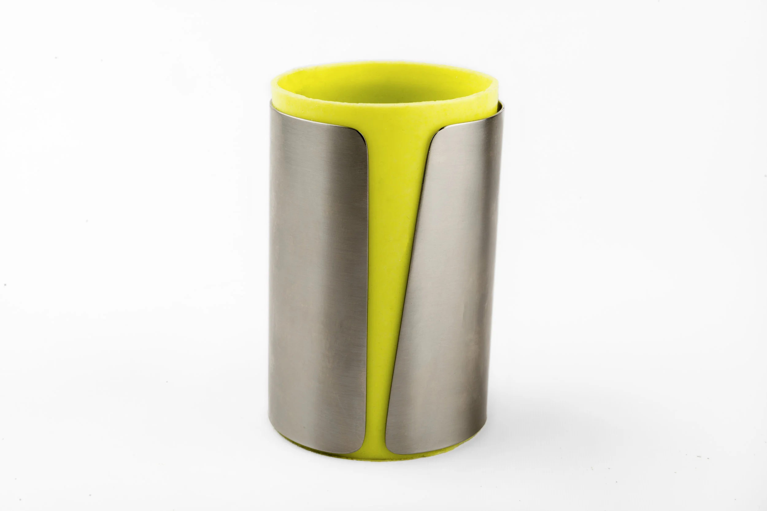

The glass consists of a double skin: the inner one is in malleable silicone and the outer one is in stainless steel for a solid grip. The stainless steel surface has an opening on the silicone layer that lets the user feel through it the level of liquid in the glass in order to avoid spills while filling the glass.
The silicone bottom helps with the stability of the glass if handled clumsily.


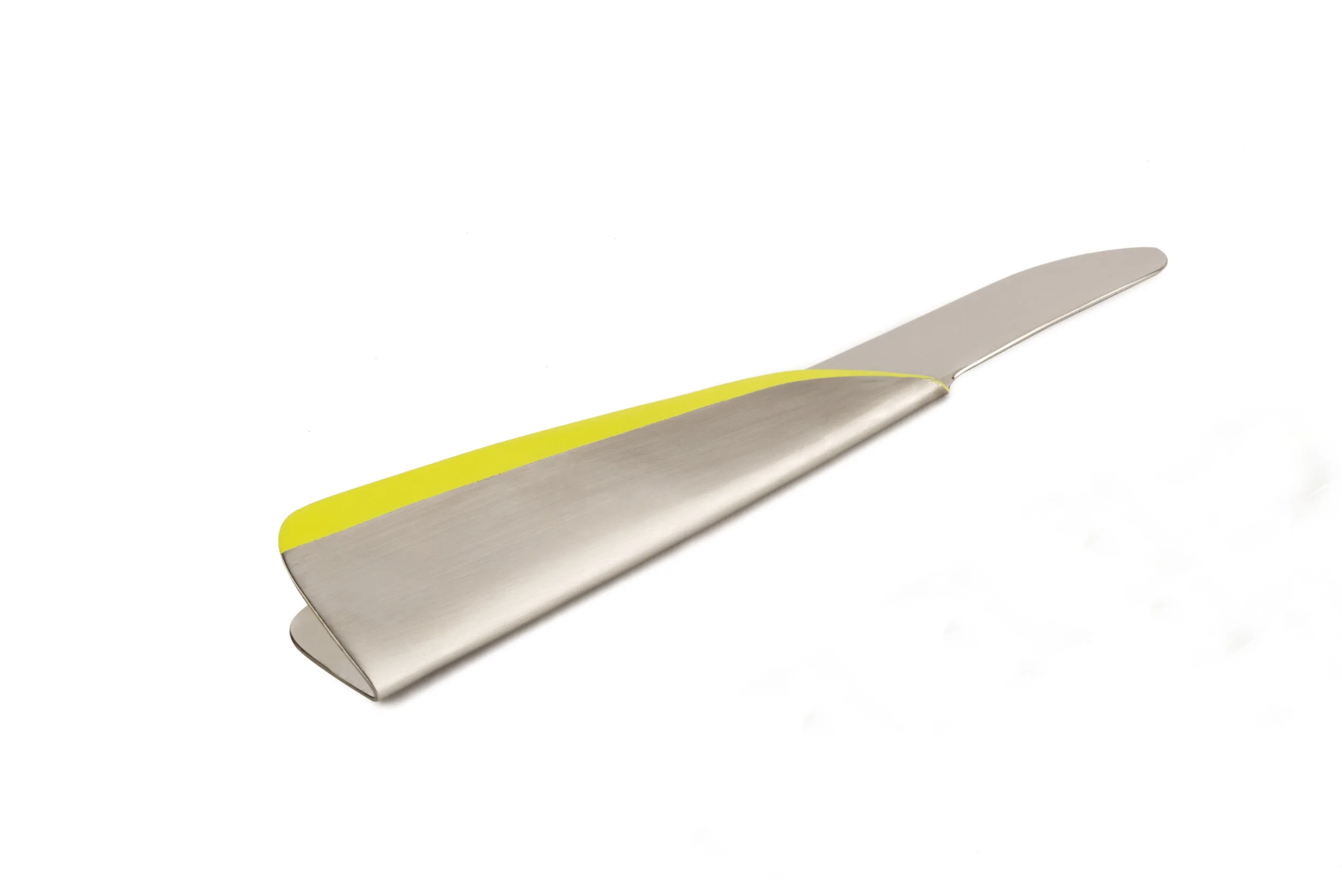


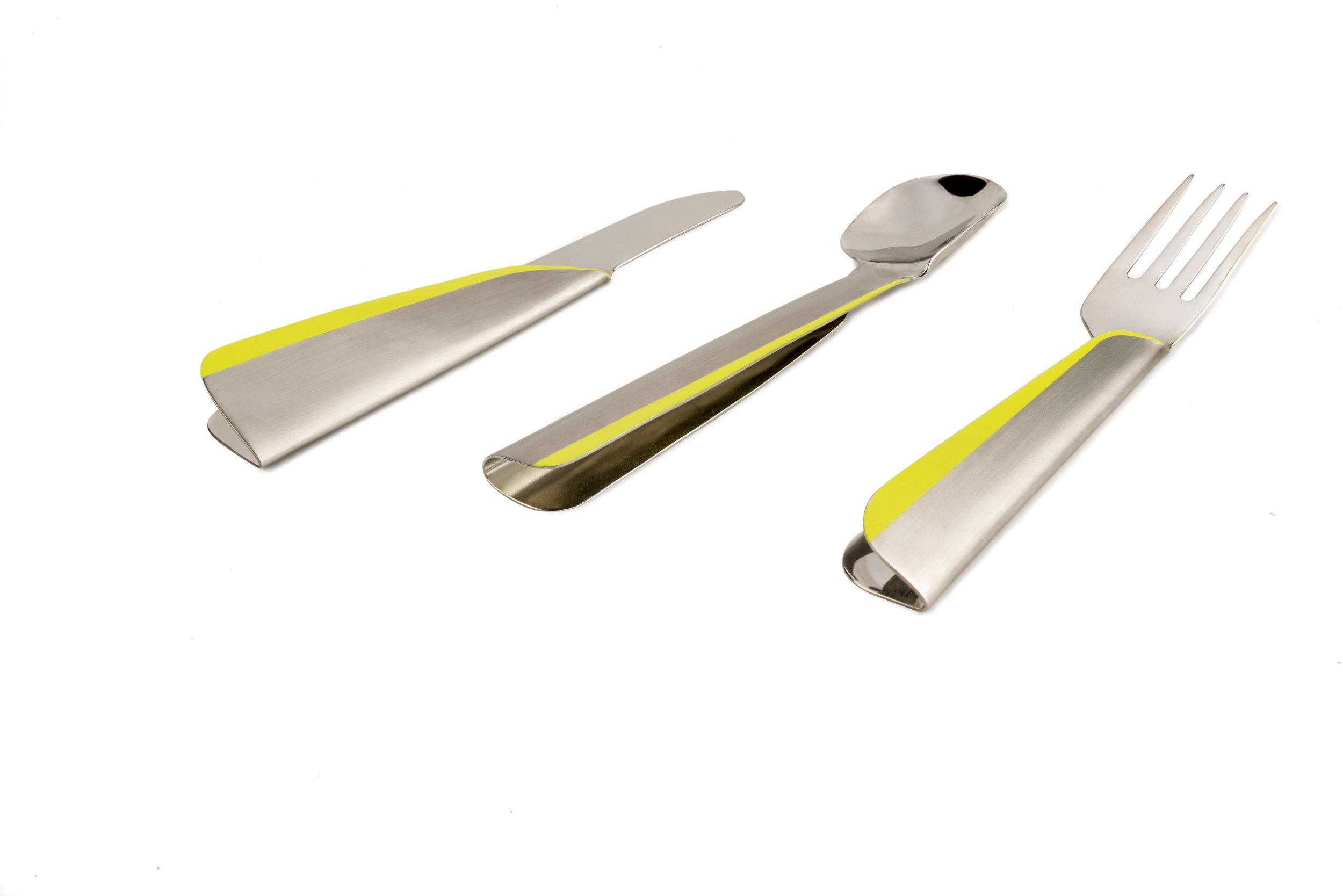
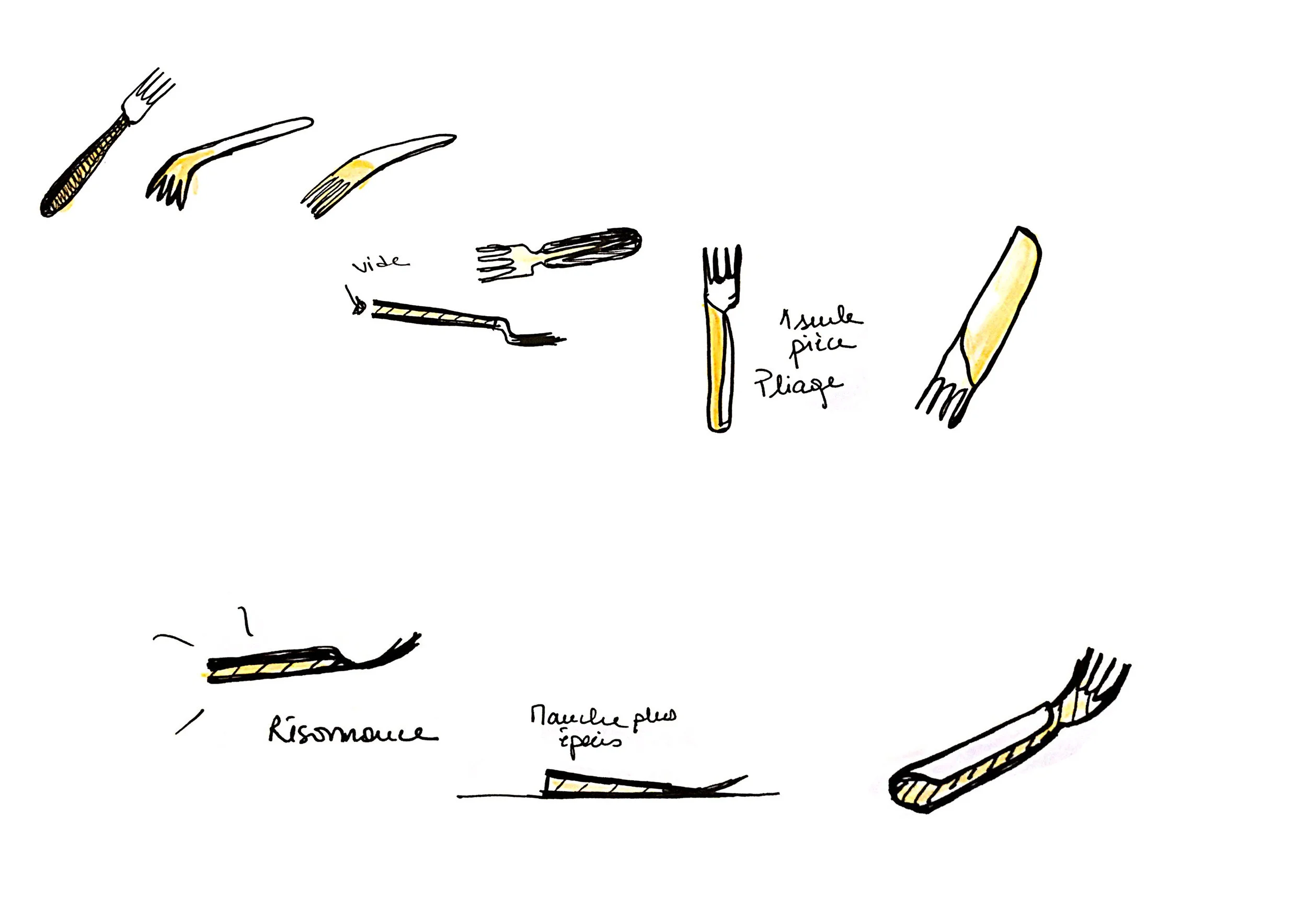
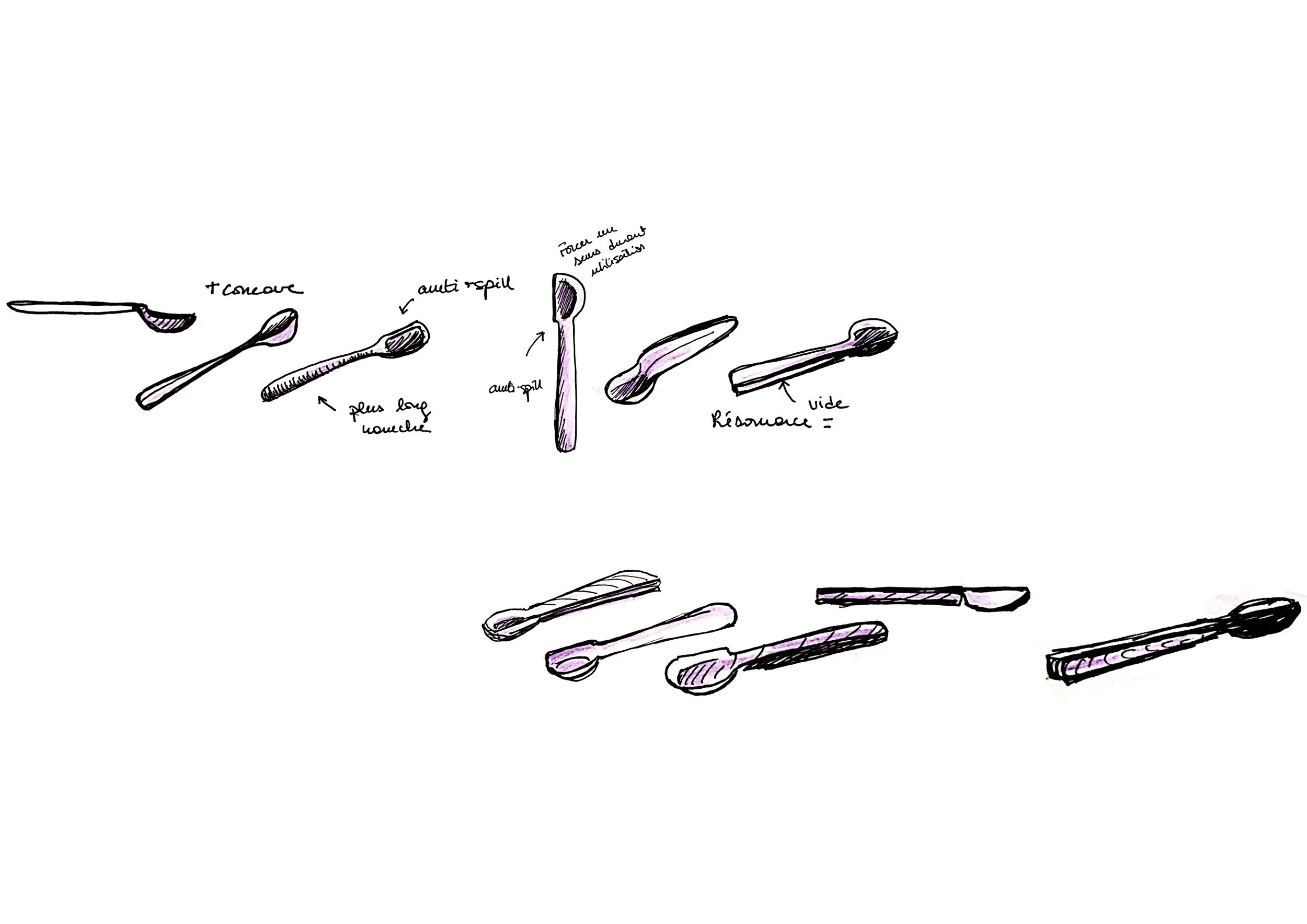
Each item of the cutlery is conceived by the same principle, which is to reinforce the resonance when the utensils are in contact with the food so that, through touch, the user can visualize better the textures and hardness of each element before eating it, as well as the force applied while cutting or sticking the fork.
The manufacturing system consists of folding a stainless steel sheet so as to create a gap between the front surface and the back surface of the utensil. This not only generates a resonance that helps the user understand the nature of the foods on his plate but it is also a discreet and clear communication on the means of use of the products (the direction of the folds show the direction of grip).
The end of each handle is wider than the head of the utensil to indicate the direction of handling. Also, the folded part of the knife indicates the direction of the blade.
A color contrast was essential for users with very minimal vision (perception of spots, light, strong color contrasts); It allows them to recognize the location of each item.
(This project is still under development)